backtotop

How to Improve Racial Equity in the Access to Medical Resources during COVID

11.454 Big Data, Visualization, And Society

By: Zihan Mei, Ryuhei Ichikura, Beko Liu

Instructor: Sarah Williams, Yuan Lai
TA: Yanchao Li, Lily Xie, Patricia Cafferky

source for background image: JRC Global Surface Water Animation

Background

NBC

Source: NBC News

Victims of COVID

There have been many cases of COVID-19 in US, but have all racial groups equally suffered from this new virus? Researchers have already studied the racial inequity in COVID-19 by using big data.

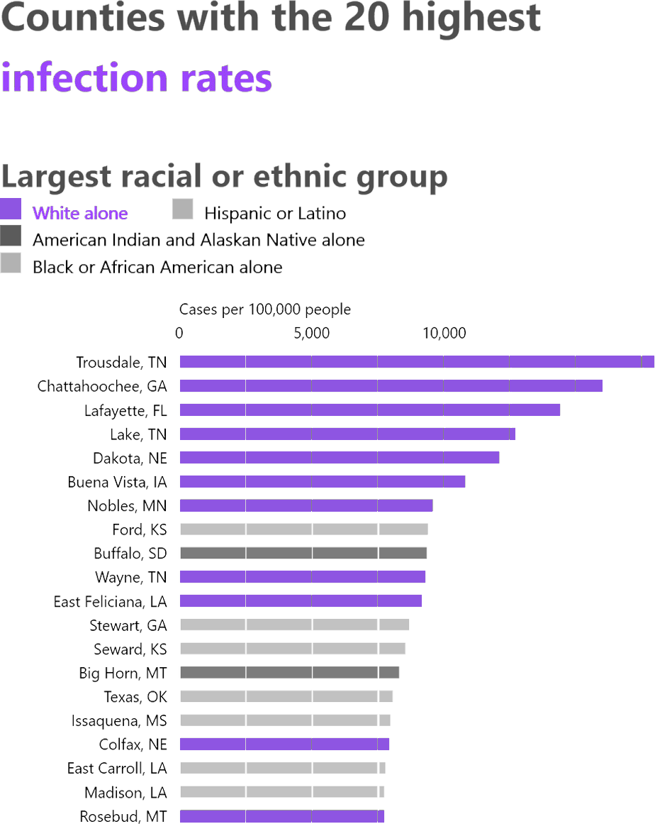
High Infection Rate in White-dominant Cities

The Atlantic launched a voluntary project, The COVID Tracking Project, and has collected data on COVID-19 testing and patient outcomes from 50 states, and analyzed racial inequity. One of the findings through this project is that high infection rate is seen more in the White-dominant cities.

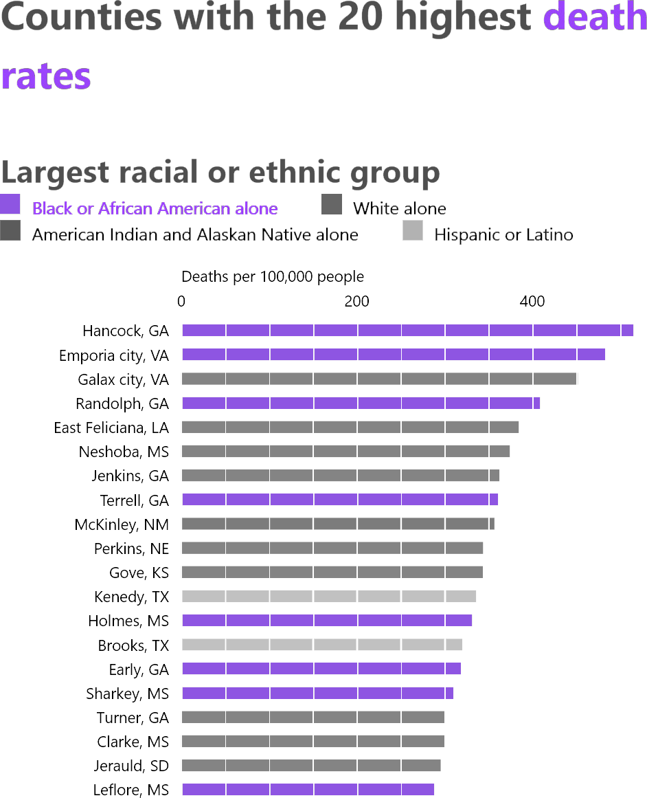
High Death Rate in Black-dominant Cities

On the other hands, it also found that the high death rate is seen more in the Black-dominant cities.

Death from COVID and Social Vulnerability

This relatively low infection and high death rate in the Black communities lead to our assumption that social vulnerability is one of the major reasons why they have tended to be the victims.
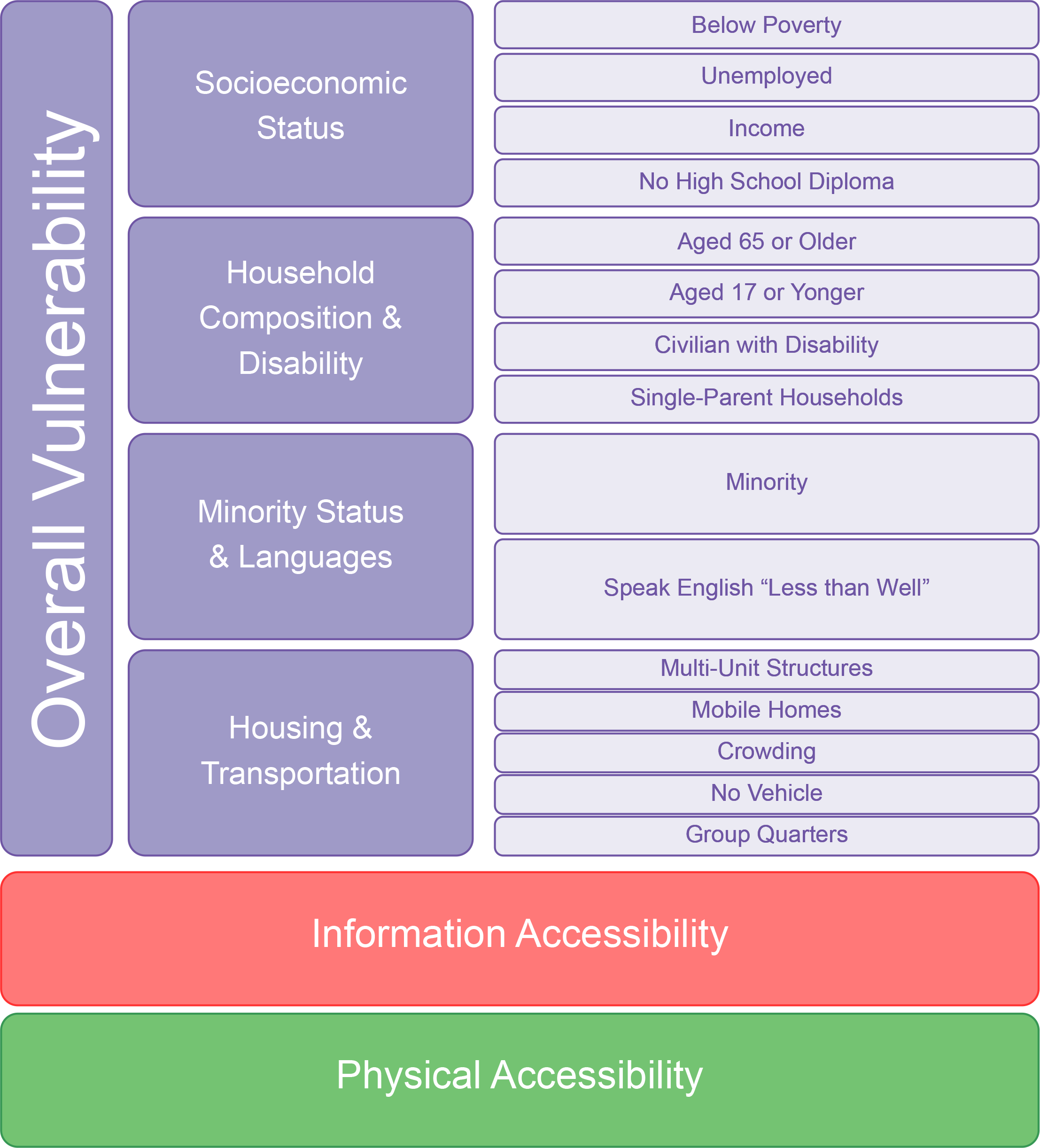
SVI+

Centers for Disease Control and Prevention (CDC) provides Social vulnerability index (SVI) in order to help local officials to identify difficulties of communities. SVI is composed of widely ranged criteria such as socioeconomic status, disability, and transportation ability. However, are these enough to explain the situation that derives from the new virus? We suppose that physical accessibility to medical facilities that can take care of patients of this new virus and information accessibility to gather the relevant information regarding the new virus are related to the death rates other than the existing SVI.

Questions to Visualize

  1. How do these types of accessibility exist?
  2. How do they relate to the death rate?
  3. Do they explain the death rate well compared with SVI?

Case Study

New York City in ZIP-scale

We focus on New York City as a case study, because it has wide variety of data, racial diversity and a number of medical facilities. Depending on the format of the collected data, we will focus on ZIP scale as seen in the left-hand racial dot map made by University of Virginia. This map is a reference to relate the demographical condition with the following research into the accessibility and SVI.

Information

Data Source:
ACS Internet Access by Education Variables - Boundaries. Updated on Jan 7, 2020.

Connectivity & Awareness of Information

We propose households' information accessibility and awareness count in the community's vulnerability. Generally, people with higher education level shall have better information accessibility such as Internet connection. Meanwhile, they are also more awared of the trend of the virus and the scientific treatments.

  • Data Used: Internet access by education
  • Map Colored by: Percentage of households without Internet access
  • Chart Drawn on: Distribution of people in different education levels
  • Interaction: Tooltips on hovering on the map districts, charts redrawn on clicking on the map districts.

Physical

Data Source:
NYC Health + Hospitals patient care locations - 2011. Updated on July 4, 2019.
COVID-19 Testing Sites. Updated on Dec 1, 2020.
Points Of Interest. Updated on Dec 8, 2020.

Physical Access to Medical Facilities

Another index we propose is households' physical access to medical facilities. The distance to those facilities reflects people's ability to get emergency treatment in time and whether they can reach out for medical help concerning COVID-19, such as testing.

  • Data Used: Hospitals patient care locations, testing sites
  • Map Colored by: Average distance from center to medical facilities in 4 kinds
  • Chart Drawn on: Minimum distance from center to medical facilities
  • Interaction: Tooltips on hovering on the map dots, charts redrawn on clicking on the map districts.

The public hospitals from NYC Health + Hospitals are classified into 4 kinds, while the facilities from Point of Interest is not classified.

Conclusion

Data Source:
CDC Social Vulnerability Index 2018 - USA. Updated on March 19, 2020.
ACS NYC Health - Coronavirus-data - data-by-modzcta.csv. Updated on Dec 2, 2020.

Synthesize New Index into SVI+

We overlap the two new index with the existing SVI from CDC. We added the dots of death rate on the map to look for inconsistence. The chart on the right displays the 3 index with death rates for all the districts.

  • Data Used: CDC SVI data, NYC health data by modzcta
  • Index Parameterized by: Rank the districts on SVI, INFO, PHYS, divide the rank by total district number and use as index.
  • Map Colored and Scaled by: Index and death rate
  • Chart Drawn on: Index and death rate
  • Interaction: Tooltips on hovering on the map dots, charts highlight on hovering on the map dots.